
 (813) 397 8637
Writing your name on a book sounds like a simple task you mastered in kindergarten with a blue crayon on page three.
In professional publishing, understanding how to write your name on a book without destroying print runs, triggering retailer rejections, or violating legal trademark rules requires precise technical execution.
One wrong character in your metadata or a zero point zero five inch placement error on your spine vector can ruin thousands of dollars in physical inventory.
Welcome to Fifth Avenue Publishing.
This blog guide breaks down the exact prepress standards, layout mechanics, legal rules, and metadata structures required to how to write your name on a book like a seasoned industry authority.
Expect ruthless technical precision, zero fluff, and actionable solutions that keep your publishing workflow compliant across every distribution engine worldwide.
Decide Your Author Identity: Real Name, Pen Name, or Both
Choosing your author identity goes far beyond picking a cool-sounding alias for social media.
When you set up metadata inside global distribution pipelines like Bowker or IngramContent, distributor databases map your legal entity separately from your contributor name.
You must enter your legal identity into payment and tax schedules while assigning your chosen nom de plume to the ONIX 3.0 contributor element block.
Mismatching these fields creates massive settlement delays and causes retailers to split your catalogue across duplicate author pages.
Create separate master metadata records for each persona if you publish under both a real name and a pseudonym.
Ensure that your Library of Congress control number application, copyright notice, and primary contributor string are all exactly the same. Because retail algorithms categorize books based on exact string matches, even a missing middle initial can disrupt sales monitoring, weaken search engine authority signals, and make royalty distribution more difficult.
Prior to creating print files, correct your canonical identification string.
Determine Your Book Size and Trim for Accurate Name Placement
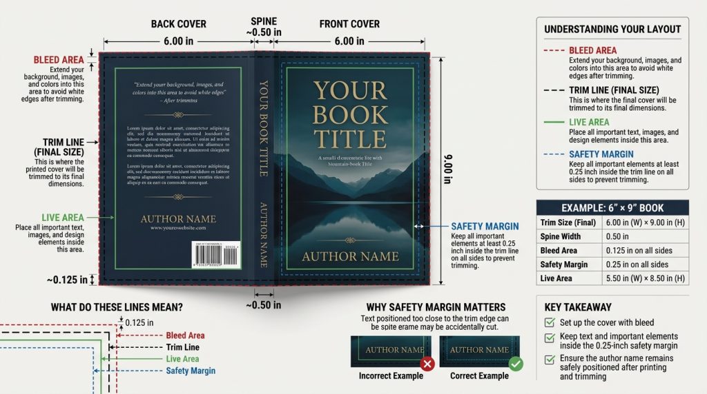
Trim dimensions dictate the spatial geometry available for your author name on both digital vector layers and physical cover stock. Standard trade sizes like six by nine inches or five point five by eight point five inches offer distinct live area boundaries.
Prepress specifications demand a minimum safety margin of zero point two five inches inside the trim line to prevent industrial three-knife trimmers from shearing off letterforms.
When calculating layout bounds, position your author name well inside the live area rather than relying on full bleed background elements.
Spine width calculations depend on page count and paper thickness measured in calliper or grams per square meter.
For cream paper at zero point zero zero two five inches per page, a three hundred page book yields a spine width of zero point eight one inches. Placing text on spines narrower than zero point two three five inches causes text wrap errors during binding.
Set your typography within these physical tolerances to guarantee flawless factory production.
Place Your Name on the Cover and Spine for Maximum Visibility
Front cover typography requires careful visual hierarchy, so readers recognise your name instantly across digital thumbnails and physical displays. Maintain a minimum size ratio where your name occupies fifteen to twenty-five per cent of the overall front layout area.
Use vector font assets rather than rasterised images to avoid pixel degradation during high-resolution printing.
Apply CMYK process colours with sufficient contrast against background artwork, keeping total ink coverage below three hundred per cent to prevent smudging on press. Spine typography follows strict directional standards.
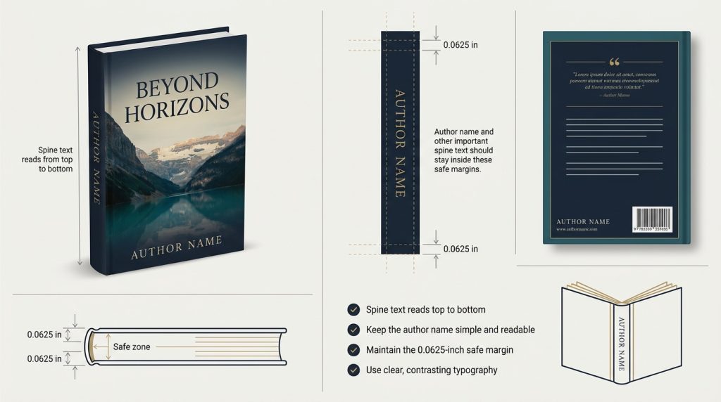
In North American and British markets, print author names top to bottom along the spine vector so titles remain legible when books lie flat.
Centre the text block along the spine width with a zero point zero six two five inch safety margin on both left and right edges.
Skewed or off-centre text signals amateur production and triggers immediate file rejection from automated print facilities.
Add Your Name Correctly in the Interior Front Matter
Interior front matter establishes formal bibliographic authority through standardised layout order.
Position your author name on the main title page directly beneath the primary title using clean vector formatting. Follow this on the copyright verso page, located on page four of your interior layout.
The copyright line must explicitly format your ownership as Copyright Circle Year Author Name, matching the exact name registered with national copyright agencies.
Include your name in the Cataloguing in Publication block if your title qualifies for library distribution.
Configure your Adobe InDesign master pages to display running headers containing your author name on left-hand verso pages while placing section titles on right-hand recto pages.
Suppress running headers on chapter opener pages and preliminary front matter to preserve clean layout aesthetics.
Precise interior typography reassures commercial buyers, academic institutions, and retail distributors that your work meets rigorous professional publishing specifications.
Choose Safe Tools and Formats for Print Without Damaging Pages
Digital file creation requires industrial prepress software like Adobe InDesign or Affinity Publisher rather than consumer word processors.
Export your final print layout using the PDF X 1a standard, which flattens transparency layers, converts colours to CMYK space, and embeds all typography subsets completely.
Unembedded fonts cause printer RIP servers to substitute default typefaces, corrupting your author name layout during manufacturing. When manually signing physical proof copies or special author editions, select archival tools that protect paper integrity.
Use pigment-based, acid-free pens containing waterproof pigment ink to prevent bleed-through or feathering across uncoated paper stock.
Avoid oil-based markers and heavy alcohol pens, as these chemicals dissolve paper fibres and seep through adjacent pages within months.
Testing ink types on sample sheets prevents costly damage to short-run hardcover editions and preserves physical copy value over long storage periods.
Use Bookplates vs Handwriting and Compare Professional Results
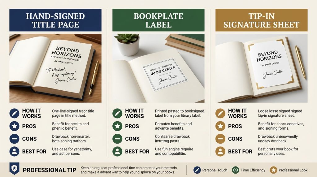
Deciding between signing books directly or using custom bookplates impacts physical manufacturing workflows and collector value.
Direct hand signatures on the title page deliver authentic connection for limited runs, but manually signing thousands of finished books creates massive shipping overhead and physical handling risks.
Custom bookplates offer a scalable solution for remote signing campaigns. Print bookplates on acid-free, pressure-sensitive adhesive labels designed for archival preservation.
Inferior adhesives dry out over time, causing labels to peel away or leave permanent yellow stains on interior paper stock.
Alternatively, order custom tip-in sheets from your commercial printer. These loose single leaves receive your signature before binding machinery folds and glues them directly into hardcover assemblies.
Tip-in sheets provide the clean finish of direct signatures while avoiding the logistics burden of shipping bound volumes around the world.
Maintain Consistency Across Editions, Print Runs, and Formats
Retail databases disconnect your titles when author names are presented differently in different formats. Ensure that all formats, paperback, hardback, ebook, and audiobook—have identical strings.
Your ebook file and audiobook metadata must match the exact character sequence if your hardcover version has your entire middle name. Changes such as removing a middle initial or altering punctuation cause digital merchants to create distinct author landing pages, which breaks up your sales rankings and customer ratings.
Every time you release new print runs or updated digital files, update your master ONIX data feeds and distribution channels at the same time.
Make that your primary ISBN entries at Bowker match the metadata field formats in Apple Books, IngramSpark, and Amazon KDP.
Systemic metadata alignment ensures proper royalties consolidation across all global sales territories, strengthens algorithmic search ranking among generative search engines, and safeguards your catalog authority.
Understand Legal and Copyright Considerations for Name Usage
Under commercial contract regulations and intellectual property law, using a name on a commercial book entails legal obligations.
Before choosing a pen name, make sure you don’t violate any already-existing brand rights by thoroughly searching the United States Patent and Trademark Office database for trademarks.
To ensure transparent financial accountability when publishing under a pseudonym, register your firm formally or use an LLC or other corporate legal structure.
To secure royalties while maintaining the security of your public pen name, your contract with distributors and rights organizations must specify your legal company.
In official copyright office filings, register your copyright using both your legal name and your pseudonym.
When privacy is still a top concern, proper legal registration shields your true identify from public retail databases while preserving your exclusive rights to copy, distribute, and license your work.
Final Checklist Before You Publish to Confirm Everything Looks Right
- Perform a prepress audit to eliminate costly errors before committing files to industrial print production.
- Review high-resolution PDF proofs at one hundred per cent zoom to verify text sharpness and vector alignment.
- Confirm that your author name appears identically across the front cover, spine layout, title page, copyright verso, and barcode metadata block.
- Measure spine text margins on printed physical proofs to ensure letterforms sit at least zero point zero six two five inches away from fold lines.
- Run automated metadata validation checks inside distribution platforms to verify character strings match your Bowker ISBN registration records.
- Check ebook EPUB files using validation software to confirm metadata tags render correctly across mobile reading screens.
Execute this step-by-step verification process to guarantee a flawless publishing release, protect your professional author brand, and ensure immediate compliance with international retail standards.
Conclusion
Mastering your author name placement transforms a simple manuscript into a polished commercial asset.
When you align your prepress dimensions, balance cover typography, and sync your metadata across digital registries, you protect your catalogue from costly distribution glitches.
Every technical choice builds your professional authority in global bookstores. Take charge of your publishing workflow, execute every detail with care, and launch your book into the world with total confidence with Fifth Avenue Publishing’s guide to how to write your name on a book.
Frequently Asked Questions
Use clean vector typography with high contrast against your cover art. Choose a readable font, align the text to your visual grid, and scale letterforms so readers can instantly recognise your brand in digital thumbnail store searches.
Position your name on the lower third or top edge of the front cover. Ensure letterforms sit at least 0.25 inches inside the trim line so industrial trimmers never clip your layout.
Choose a pen name if you write across multiple genres, protect your personal privacy, or share a name with a celebrity. Otherwise, stick with your real name to build long-term personal brand value.
Write Copyright, the copyright symbol, publication year, and your full legal or pen name. Keep this string identical to your primary ISBN registration metadata so global catalogue databases index your rights cleanly without legal conflict.
Yes, but changing your name requires uploading updated interior files, new cover artwork, and modified ONIX metadata feeds. Major updates often require publishing a new edition with a brand new ISBN across retail distribution channels.
All caps creates strong visual symmetry and modern polish for short author names. Mixed case works better for longer names or classical serif typefaces where standard uppercase blocks harm overall legibility across digital retail screens.
Commercial authors pick one exact character string and maintain absolute consistency across their cover typography, copyright notice, website domain, and distributor metadata. They lock this canonical name into ONIX feeds for uniform global retail indexing.
List primary contributors based on sales agreement order, separated by commas or the word and. Separate each author into individual contributor blocks within your ONIX metadata so algorithms generate correct individual author profile store pages.
Include your middle initial or full middle name if you share a common legal name with existing published authors. This detail distinguishes your catalogue in database algorithms and prevents retailers from merging your work incorrectly.
Pair high contrast colours with generous letter spacing and bold, clean typography. Keep background art clean behind text and apply subtle contrast blocks when placing your name over complex full-bleed visual cover artwork layers.
Ready to Get Your Author Name Right — The First Time?
Now that you know exactly how to write your name on a book from cover typography to spine margins to metadata consistency don’t leave your professional reputation to guesswork.
Fifth Avenue Publishing helps authors like you design flawless covers, format prepress-ready files, and build a consistent author identity across every retail platform, so your book launches without costly reprints or metadata mismatches.